
Blush Placement and What It Actually Does to Your Face Shape

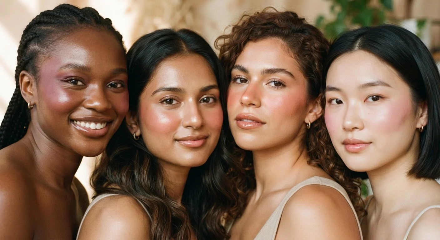
Photo: FaqExplorer.net | Informative Website editorial
Key Takeaways
- Blush placement changes perceived face shape far more than blush color does.
- Applying blush too low on the cheek can drag the face downward visually.
- Round faces benefit from angled, upswept blush; longer faces benefit from horizontal placement.
- Cream blush integrates with skin differently than powder, affecting how placement reads under light.
- There is no universal placement rule - working with your specific structure matters most.
Why Placement Outweighs Color
Most people choose blush by shade - a dusty rose, a peachy coral, a deep berry. Color matters, but where you apply that color is what actually restructures your face in a viewer's perception. A perfectly matched shade applied in the wrong zone can make cheeks look heavy, faces look longer, or features look unbalanced.
The face reads as a three-dimensional object because of light and shadow. Blush, being warm and pigmented, reads as a raised, illuminated area. Whatever falls beneath it - or beside it - appears to recede by contrast. This is the same logic used in contouring, except blush uses warmth and color rather than shadow. Understanding this lets you use blush intentionally, not just decoratively.
Before you apply anything, it also helps to understand your skin's prep. The layering order of skincare and primer affects how blush adheres and how long placement holds throughout the day.
How Face Shape Changes the Rules
There is no single universally flattering blush placement - because there is no single universal face shape. Here is how structure generally interacts with placement:
- Round faces: Blush swept diagonally upward from the cheek toward the temple elongates and adds angles. Keeping color away from the center of the face reduces the appearance of fullness.
- Long or oval faces: Horizontal blush placement - applied straight across the cheekbone with minimal upward angle - adds visual width and balances the length. Circular application on the apple of the cheek can achieve a similar grounding effect.
- Square faces: Applying blush on the upper cheekbone with a soft upward sweep softens the angular jawline by drawing attention upward.
- Heart-shaped faces: Blush centered on the cheekbone and blended lightly downward balances a wider forehead against a narrower chin.
These are frameworks, not formulas. Your features are three-dimensional and individual, and small variations - higher cheekbones, deeper-set eyes, a stronger brow - shift the optimal placement meaningfully.
60%+
Of blush application mistakes are placement-related
Industry makeup educators frequently cite placement - not shade selection - as the most common blush error among consumers learning facial makeup techniques.
3 zones
Primary blush placement zones on the face
Professional makeup training typically identifies the apple, cheekbone, and temple as the three primary zones where blush placement decisions are made.
Techniques Worth Understanding
Several established techniques go beyond basic cheek application:
Draping extends blush up through the temples and sometimes beneath the lower lash line. Originally a editorial technique, it has become more wearable in everyday contexts. It uses color as a sculpting agent across a wide swath of the face.
Apple-of-cheek placement - the soft, rounded area that lifts when you smile - creates a youthful, flushed-from-within effect. It reads as fresh and informal, but applied too low it can pull features downward.
Cheekbone-focused placement - directly on the bone and swept toward the ear - reads as more structured and angular. It's well-suited for those seeking definition rather than softness.
Your blush formula also shapes your results. Cream formulas blend into the skin and can be layered gradually, making them forgiving. Powder blush sits more distinctly on the surface, so clean edges and careful blending matter more. Knowing how your skin undertone interacts with color helps you pick shades that read naturally in any placement zone.
Start Lighter Than You Think You Need
Lighting and the Real-World Check
Studio lighting flattens. Bathroom lighting distorts. Blush that looks perfectly blended under a vanity bulb can appear patchy or overly intense in daylight - or conversely, invisible outdoors when it looked bold inside.
The most reliable check is natural, indirect daylight near a window before you finalize your look. This shows true color intensity and reveals any unblended edges. If you wear blush to different settings - indoor office, outdoor events, evening venues - understanding how your placement shifts in each context helps you adapt without guesswork.
Warm, directional light amplifies blush. Cool, diffuse light softens it. If you frequently move between environments, slightly sheerer application with well-defined placement tends to hold its intention across different lighting conditions better than heavy pigment in a single zone.
This article is for informational and educational purposes only. Individual results may vary based on skin type, formula, and technique.
Frequently Asked Questions
The content on this site is provided for informational purposes only and should not be considered a substitute for professional advice. While we strive to provide accurate and up-to-date information, we make no guarantees regarding its completeness or accuracy. Always consult a qualified professional for advice specific to your circumstances before making any decisions.